Ti West’s The Innkeepers
Just uploaded is a review of Ti West’s latest horror film, The Innkeepers (2011), which opens at the TIFF Bell Lightbox Friday February 3rd, and whose soundtrack is available January 31st.
I loved West’s last film, the salute to eighties slashers The House of the Devil (2009), and appreciated the bulk of his little-seen forest thriller Trigger Man (2007), and in all three films one can trace his gradual recognition of tighter & coherent plotting – aspects largely absent in his debut feature The Roost (2005), a film that does have admirers, but it’s a film hampered by the kind of contrived scenes and slow pacing that can become interminable.
Characters running in and out of locations works only if the reasons for their actions has purpose, and a finale only satisfies if the heroine hasn’t done something massively stupid. (In the case of House, all the babysitter had to do was pick up the gun, kill her tormentors, and voila! She’s free!)
Sometimes it’s forgivable when the pluses outweigh the errors, and while Innkeepers isn’t perfect, it’s a successful little ghost tale that shows off West’s skills at creating a mounting sense of dread before a classically-crafted shock. It’s also a great example of how to mine a great location, building on its existing mystique, letting the actors react to its maze-like structure, and establish in clean, simple scenes the parameters of where they’re safe, and where they must never, ever venture but inevitably must in order for there to be a movie.
It’s also unusual that West set his film in a working hotel and used its name, a savvy move that will probably see a spike in the Yankee Pedlar Inn’s clientele for a while. It’s an impressive building with lovely wooden trim, and its wide lobby and long corridors allowed West to have fun with the 2.35:1 ‘scope ratio.
In addition to the film review [M], there’s the soundtrack review [M] of Jeff Grace’s score (released by Screamworks Records / MovieScore Media).
Grace may be the only composer thus far who can take my favourite instrument – the cello – and turn it into an instrument from Hell. Innkeepers isn’t as terrifying as The Roost or Travis Betz’s Joshua (2006), but it’s a solid horror score which really ought to be experienced in a theatre; that main title sequence is wonderful at establishing the mood and emotional parameters of the film, and its so-called mumble core characters.
.
A slight (and final) tangent
Although the film will get primary attention by critics, I’m compelled to pay compliment to the very nature of West’s indie stature, because like his colleagues, his films are (ideally) sold using campaign art that doesn’t feature the banal big star heads in standard Photoshop friezes.
Within the studio realm, poster design over the last few years has degenerated into a lazy assignment of placing heads on posters, solely so passersby can recognize the star and base their decision to buy a ticket on that actor or actress’s fan base. Most studio posters are designed with little imagination, and it’s often indie artists working on spec or special commissions who draw from the artists and periods they admire, and create works that push a poster design to its proper artistic and functional apex.
There may be more Innkeeper posters out there (or more to come), but remember the video posters we always see online and in stores? Big heads, predictable expressions, and lots of Photoshopping. The problem with the lot is that every studio is working from the same narrow mental template of selling a film’s most recognizable elements, so when you line up studio-produced films, you see a monotonous pattern of heads, of similar objects placed in similar areas of a DVD / Blu-ray cover. The end-result is a sense of sameness, which defeats the purpose of hiring a graphic designer educated in making things distinct.
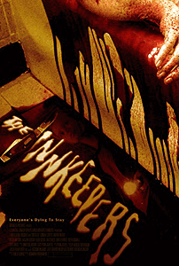
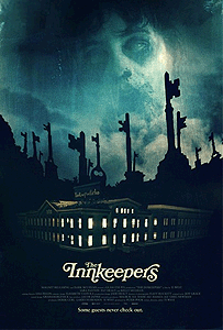
Below are four very different poster styles I found for The Innkeepers. Where you see heads, they are small parts of a greater stylistic design that as a whole makes that poster stand out from the banal. They are deliberately retro, and they will work in catching your attention because what studios have failed to understand is the ability of audiences to maintain their own repository of commercial art, be it recent, classic, or iconic:

Dreamy eighties effort that's oddly more PG-friendly, suggesting a mystical, tongue-in-cheek journey in place of death-by-fright.

A poke at the iconography of 70s posters where one image, tied to a styled title design, infers unseen horrors paying audiences will be privileged to experience.

A contemporary poke at the "Saw" and Dark Castle campaigns where mayhem saturates the image, and the title's smeariness is reflective of the film's gore intensity. Of course, this image infers a slaughterfest that never happens. It's an art director who simply ran with one image that lasts for a few seconds. In other words: a cheat.
.
They all work, and not one features a big stupid head.
Kind thanks to all.
.
.
Mark R. Hasan, Editor
KQEK.com ( Main Site / Mobile Site )
Category: EDITOR'S BLOG, FILM MUSIC, FILM REVIEWS


Connect